Using icons that show both action and state
Which of these icons means 'you are subscribed to email notifications', and which one means you aren't?


This icon means: You are not subscribed.
This icon means: You are subscribed.
Obvious, eh?
Even with the tooltips: 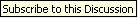 and
and 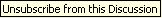 it isn't immediately clear what's going on, especially when you're in the 'subscribed' state.
This is a case of trying to use one icon for two different purposes which are at odds with each other: showing action and showing state. The designer intend this icon to convey the idea of a subscribe action: "If you click this button, you will be subscribed". The button shows the future state.
Likewise, is supposed to show the unsubscribe action. It is in effect showing a future state of not being subscribed. (Whether a 'no entry' symbol is the best for this is another matter entirely).
A similar problem can sometimes be found by developers trying to show the actions 'lock' and 'unlock' with a padlock icon.
Rather than interpreting these as action buttons indicating a future state, most users will probably see these as a toggle button indicating the current state, and get completely the opposite impression from what is actually going on. The best solution is to implement the buttons as though they were toggling the current state, and make the tooltips reinforce that. Its the user's natural assumption anyway, so why not take advantage of it?